The Evolution of Design Systems
June 14, 2023 - 10 min read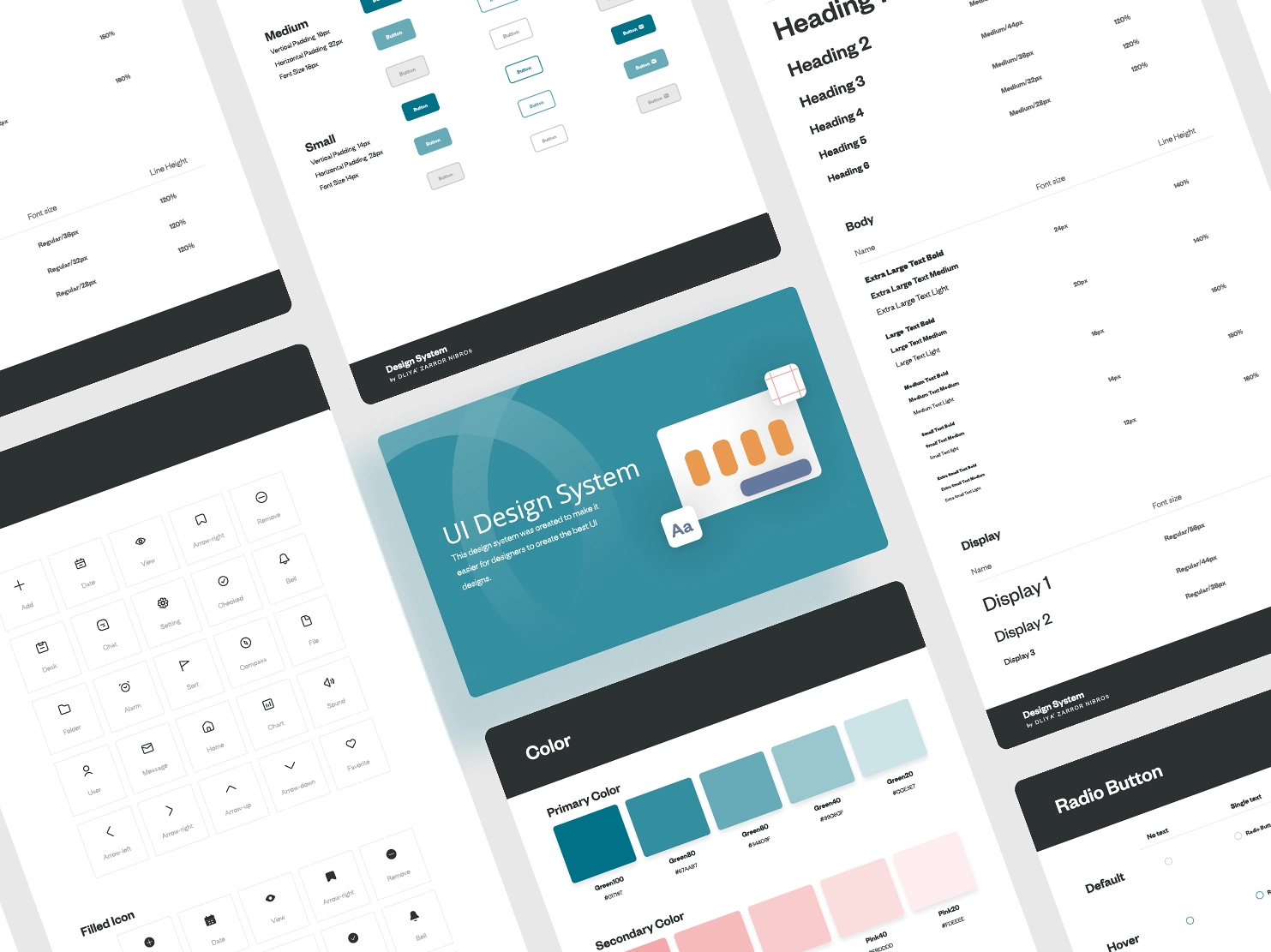
Design systems have undergone an extraordinary evolution in recent years, transitioning from basic style guides into extensive ecosystems encompassing visual design, UI components, and code libraries. Their vital role in UX design ensures that keeping ahead of contemporary trends and best practices remains paramount for designers and developers alike.
While visual design, with its typography, color schemes, and iconography, forms a key cornerstone of a design system, it is critical to understand that design systems extend far beyond this. At Interpix, our focus when crafting design systems is heavily placed on the UX design aspect.
Inspired by the atomic design philosophy, component-based design has been widely adopted for some time. By deconstructing designs into atomic elements, including atoms, molecules, organisms, templates, and pages, design systems strive to mitigate inconsistencies across software platforms. Templates serve as a vital cog in a design system, providing context that facilitates the replication and scalability of designs.
Consistency throughout the platform has always been the primary objective of design systems. The development of advanced tools and technologies now allows for the easy implementation and maintenance of design systems through code, leading to a shift towards design systems that are dynamic, adaptable, and efficient.
For over three decades, Interpix has been creating design systems. Initially termed as "UX Standards", "Style Guides", and other monikers, our design systems have evolved to prioritize UX. We maintain that guiding principles should shape the overall architecture and interactions, while UI elements remain a key part of the system.
Our design systems comprise various elements:
- A style guide dictating the aesthetic of the brand experience, encapsulating logos, colors, fonts, and iconography.
- UX patterns and interaction models offering solutions to prevalent user issues.
- Component libraries housing all elements, such as buttons, forms, and navigational elements, contributing to the overall user experience.
- A content strategy defining how content will be tailored based on user preferences and context.
- Software sources and code samples enabling implementation by development teams, thereby reducing the need to recreate individual assets with each new build.
It is vital to differentiate a design system from a style guide. Style guides emphasize visual elements, whereas design systems encapsulate a broader scope, incorporating UX considerations. However, it's crucial to educate the development team about the appropriate use of design systems.
The creation of a design system marks the beginning; its maintenance is equally crucial. A design system should be perceived as a living document, subject to continual refinement and updates. Considering everything in context, accommodating variations, and regularly revisiting for updates are fundamental aspects of maintaining an effective design system.
Components act as the building blocks of pages and content within a design system. It is imperative to ensure that developers correctly implement these components, thereby maintaining consistency and adhering to the provided guidelines. Furthermore, alignment across devices, screens, and technologies is key to a seamless user experience.
Design systems offer reusable components and established patterns, aiding organizations in creating consistent and user-friendly interfaces. However, keeping the patterns crystal clear to evade confusion and potential UX issues is crucial. A well-maintained design system serves as a core foundation for organizations, empowering them to continuously refine and update their products.
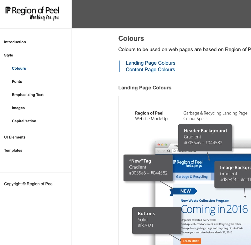
In the early stages, our design systems were rather simplistic. For instance, eight years ago, when we collaborated with the Region of Peel on their website design, we created a basic design system to ensure a common set of guidelines for all departments when updating their respective sections of the website. Despite being composed of basic elements and developed as static images and text in HTML, it enabled the Region of Peel to achieve alignment across departments, albeit with more rudimentary technologies.
Fast forward to 2023, and design systems have dramatically evolved, not only in the technologies employed but also in the UX components utilized in their construction. A recent project with Dye & Durham saw Interpix Design challenging its capabilities to build a functional design system that encapsulated the core brand essence while allowing flexibility for customization on each property.
Leveraging Figma, Interpix Design crafted an integrated and cohesive design system that embodies Dye & Durham's vision and values. The design system comprises a wide array of elements, including a flexible color palette that conveys the desired emotions and tones, a carefully curated typography selection that ensures professionalism and readability, and a set of well-defined guidelines that ensure consistency across all brand touchpoints. Moreover, Interpix developed an assortment of meticulously designed UI components, icons, and patterns that not only augment the user experience but also expedite the development process. This design system revolutionized Dye & Durham’s visual identity, establishing a robust foundation for the creation of impactful and consistent designs across various platforms and mediums.
The growth trajectory over the years has been remarkable, transitioning from basic HTML design systems to functional design systems developed within Figma. This evolution underscores the importance of staying ahead of the curve in terms of technologies and best practices. It has enabled us to continue to evolve and deliver the most effective and beneficial design systems for our clients.